
We’ve rebuilt enough dental practice websites to spot the pattern within thirty seconds. The homepage leads with a slider of stock smiles. There’s a long “About Dr.” essay in the third person. Below the fold, a phone number in grey text at 14 pixels. The booking link, if it exists, goes to a generic contact form that lands in an inbox nobody checks until Monday.
It does the wrong things beautifully and the right things badly. That’s the problem.
A dental website isn’t a brochure. It’s the front desk after hours, the answer to “do they take my insurance,” and the deciding vote when someone in pain is comparing three practices on their phone at 11pm. Most fail at exactly that moment. After nine years building WordPress sites for service businesses, here’s what we know about the ones that book new patients.
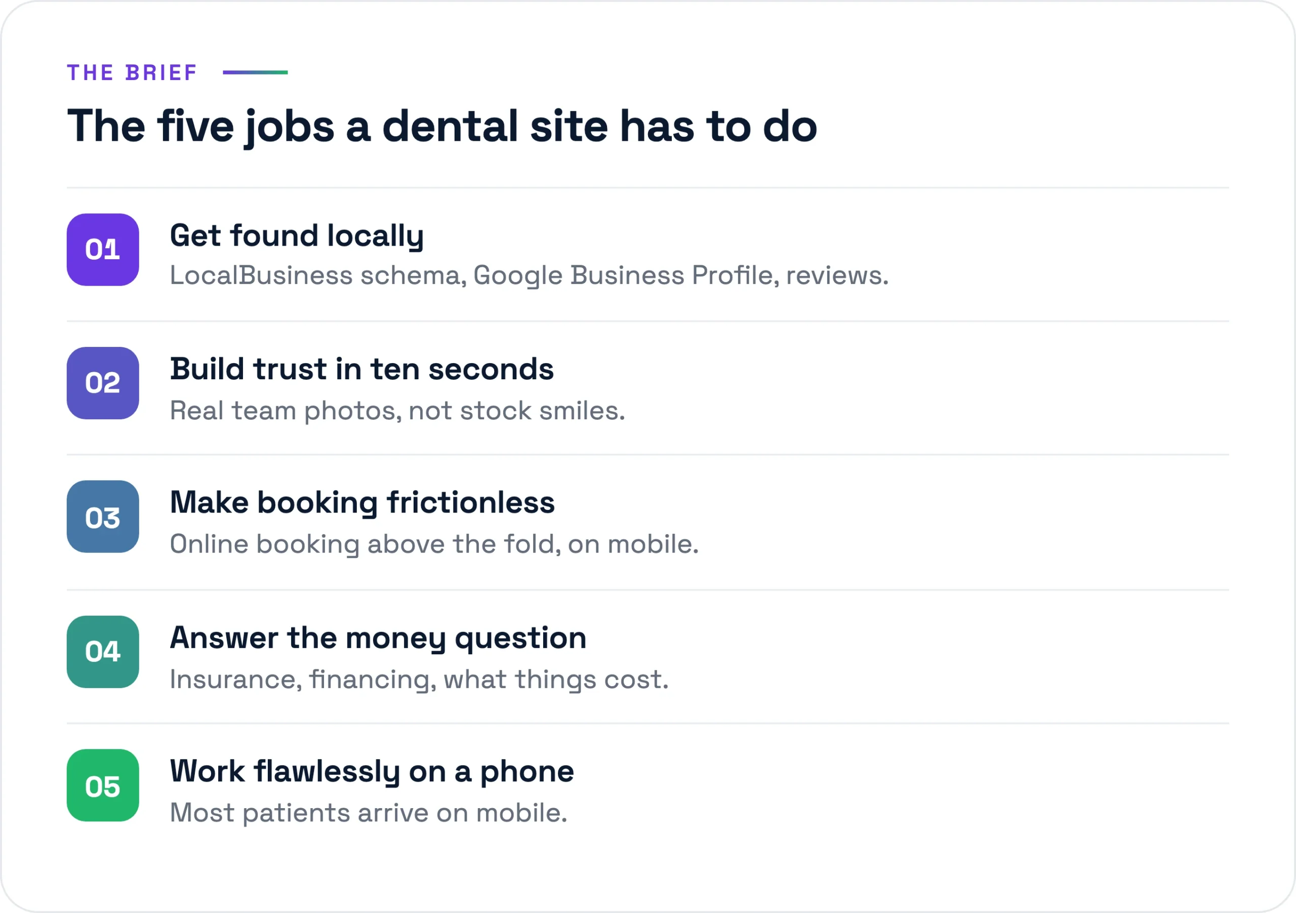
The five jobs a dental site actually has to do
Strip away the design conversation and a dental site has five jobs. Everything else is decoration. Do these five well and it works. Do them badly and no amount of photography saves it.
1. Get found locally
Nobody searches “best dentist in the country.” They search “dentist near me,” “emergency dentist [town],” or “pediatric dentist [zip].” The practices that win those searches show up in the Google map pack, not just the blue links below it. That’s local SEO and Google Business Profile work, mostly invisible on the site itself.
2. Build trust fast
People are nervous about dentists. The site has about ten seconds to signal “this is a real, competent practice run by humans I’d let near my mouth.” Real photos of the actual office and team do this. Stock photography does the opposite, because everyone has learned to recognize it and it reads as hiding something.
3. Make booking frictionless
The highest-value thing a dental site does is turn a visitor into a booked appointment. Every step between “I want to come in” and “I’m on the calendar” leaks patients. A form to an unmonitored inbox is not booking. Real scheduling that writes into the practice management system is.
4. Answer the insurance and cost question
This is the question that actually drives the decision, and the one most sites refuse to answer. “Do you take my insurance?” “What does a cleaning cost without it?” “Do you offer payment plans?” Practices treat these as awkward phone conversations. Patients treat a site that won’t answer them as a practice hiding the price.
5. Work flawlessly on a phone
Most dental searches are mobile, and a good share are urgent. Someone with a cracked tooth won’t fight a slow, cramped site. If the page takes six seconds to load over cellular, you’ve lost them before the hero image even paints.
What most dental sites do well that doesn’t matter
Worth naming the wasted effort, because budget spent here is budget not spent on the five jobs. The hero slider of stock smiles is the first thing built and the first thing to cut: it adds load time, pushes the real content down, hurts Core Web Vitals, and convinces no one. The long “About Dr.” essay is the second. There’s a place for the dentist’s story, but it isn’t 800 words on their philosophy of care. Two tight paragraphs and a real photo beat an essay. And the services grid of pretty tooth icons labeled “Cosmetic,” “Restorative,” “Preventive” looks finished and says nothing.
The stack we deploy
We build these on WordPress, and for dental practices the reasoning is boring in the good way. The practice can update its own hours and team page without calling us. The booking and review tools all have mature WordPress integrations. It runs fast and cheap on managed hosting. Here’s the actual stack.
- Hosting: Kinsta. Managed WordPress on Google Cloud, server-level caching, daily backups. A single-location practice sits comfortably on the entry tiers, US$35 to 70 a month all-in. Fast hosting is the cheapest performance win available, and dental sites live or die on mobile speed.
- Build: Bricks. We build in Bricks now (Elementor for years before, and we still maintain plenty of those). Bricks ships cleaner markup and lighter pages, which matters directly for the mobile speed job.
- Performance: WP Rocket plus Cloudflare. Page caching, lazy-loading below the fold, and a CDN so the site is fast whether the patient is across town or two states over.
- Security: Wordfence. A site collecting any patient detail is a target. Firewall, login hardening, two-factor.
- Booking integration. The load-bearing piece. We integrate the practice’s existing scheduling system (LocalMed, NexHealth, or whatever ties into practice management software like Dentrix or Open Dental) rather than a generic WordPress booking plugin that doesn’t know whether the chair is actually free.
- Forms: HIPAA-aware. Not the default WordPress mailer. More on this below.
- Reviews and SEO: a real Google Business Profile tie-in plus RankMath. RankMath handles on-page SEO and schema; the Business Profile work happens off the site but feeds it.
Schema that helps you get found
Most dental sites have no structured data, or generic Organization schema that tells Google nothing. We mark up every location with LocalBusiness and the more specific Dentist type, with the exact name, address, phone, hours, and geo-coordinates that match the Google Business Profile down to the punctuation. Mismatches between site and Profile confuse the listing and cost ranking. On top of that, real review schema: aggregate ratings pulled from genuine patient reviews, not invented numbers, which can earn the star rating in search and a reason to click your listing over the practice two blocks away.
HIPAA-aware forms, specifically
If a form can collect a name plus a health detail (“I think I chipped a molar”), that’s protected health information. The fix isn’t complicated, but it has to be deliberate. We use a form solution that will sign a Business Associate Agreement, encrypt submissions, and avoid emailing PHI around in plain text, routing into a system the front desk monitors. The sensitive intake (full medical history, insurance numbers) stays inside the booking or patient portal built for it. The marketing site’s job is to get them to book, not to be the medical record.
The content that actually books new patients
Design gets the attention. Content does the booking. These are the pages that move people from browsing to booked, in rough order of impact.
Services pages with real information
A page per significant service, with actual information on it. What the procedure is, who it’s for, what it involves, and where you can give it, a price or a range. “Single-visit crowns, typically US$1,000 to 1,500 depending on the tooth” beats a beautiful icon. These pages also rank for the searches that bring in high-value patients: implants, Invisalign, veneers, emergency care.
A real new-patient page
The most underrated page on a dental site. What happens at the first visit, how long it takes, what to bring, what it costs, how to book it. New patients are the growth engine of a practice, and most sites make them guess. A clear new-patient page removes the friction that keeps nervous first-timers from picking up the phone.
Insurance and financing clarity
List the insurance plans you accept by name. Say plainly whether you’re in-network or out, and what that means for the patient. If you offer CareCredit, in-house membership plans, or payment options, say so on the page, not just at the desk. This page quietly settles the decision, and almost nobody builds it well.
Genuine reviews, in context
Real reviews pulled from Google, placed near the decision points on the service pages and the booking flow, not quarantined on a “Testimonials” tab no one visits. Anonymous five-star blurbs do nothing. A specific review that names the hygienist and the thing she did well does a lot.
Team photos that are actually them
Spend the few hundred dollars on a real photographer for an afternoon. The actual dentist, the actual hygienists, the actual front desk, in the actual office. When a nervous patient walks in and recognizes the person who greets them from the website, that’s trust built before a word is spoken. Strangers in stock scrubs do the opposite.
The mistakes that quietly cost patients
These rarely announce themselves. The practice doesn’t see the patient who bounced. But they’re the difference between a site that earns its keep and one that’s just expensive wallpaper.
- Slow mobile. A hero video, an unoptimized 4MB photo, a pile of plugins, and the page crawls on a phone over cellular. The patient with the toothache is already calling someone else. Get largest contentful paint under 2.5 seconds on mobile or nothing else matters.
- A hidden phone number. Plenty of people still want to call, especially older patients and anyone in pain. The number belongs in the header, tappable, on every page, not buried in the footer in grey text. That’s revenue you’ll never see on a report.
- No online booking, just a contact form. A form in an inbox is a maybe. Real scheduling that shows open slots and confirms the appointment is a booking. The gap is enormous, and it’s the most common thing we fix.
- Generic stock everything. Patients have seen these exact smiling models on four other dental sites. It reads as a practice with nothing real to show.
- Site and Google Business Profile that disagree. Different phone, old address, hours that don’t match. It confuses Google, and the patient who shows up at 6pm to a locked door because the site said you were open.
Where to actually spend the budget
If a practice has a fixed budget and asks where it goes, the answer isn’t “a bigger slider.” It’s fast mobile hosting, real booking that writes into the schedule, a phone number you can’t miss, honest pages about insurance and cost, and an afternoon with a real photographer. The clean design is the easy part once those are right.
The pattern holds across nine years of builds: the practices that grow online answered the patient’s real questions faster and with less friction than the practice down the road. You can see how we approach work like this in our portfolio, or how we scope a project on our services page. If you’re looking at a site that does the wrong things well, send us a brief and we’ll give you an honest read on what’s costing you patients.